Frequency Analysis
Wordle is all about selecting words that have the highest chance of containing the same letters as the solution. To maximize the chances, any logical player would guess a word that contains the most common letters. This was the intuition behind implementing frequency analysis on the data set.
To accomplish this, we imported the list of our choice (as mentioned in background) and ran our algorithms on it. Throughout our design process, we encountered a variety of methods to do this including basic letter frequency, positional frequency of each letter, and position frequency of specific letters. In this section we will explain each of these methods while talking about our motivation, analysis, and results.
Letter:
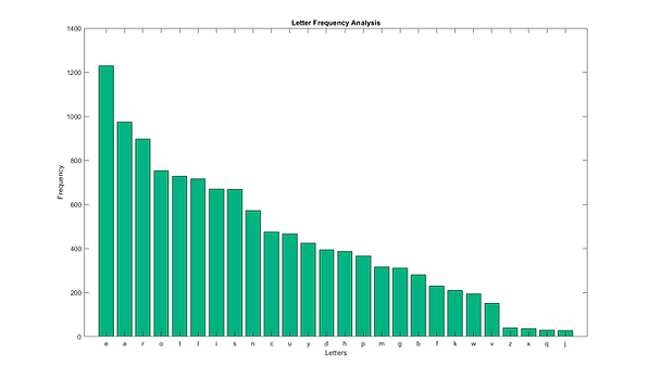
Basic letter frequency analysis consisted of iterating through every letter of each word on the selected list. Storing this information in vectors allowed us to find the probability of each letter by dividing the letter occurrences with the total number of letters. In the graph below, we show the letter distribution on the whole alphabet. Logically, this makes sense because letters like e, s, o, and r occur much more frequently in the English language. To get the plot below, we graphed the amount of occurrences for each of the letters.
Position:
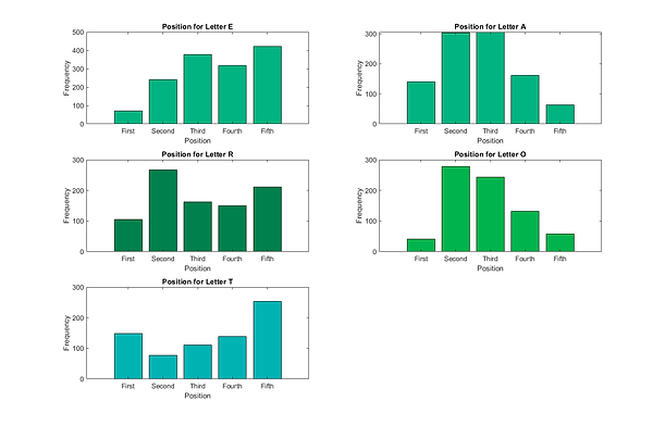
Positional Analysis combines the functionality of the letter frequency analysis with the positional frequency data. While we are reading in every letter of every word, we are also storing the locations of every letter. We are essentially creating a vector of vectors that has the 5 potential positions of each word. Using this, we can favor words that utilize a letter’s most frequency position over a word with less optimal position. Looking at the top ranks of each method, shows how this affects the results. In the figures below, we have an example of the higher frequency letters with their respective positional analysis. It shows how the locations of each letter vary by letter position. We can take this into account when recommending words because if there is a missing letter, we choose a higher frequency letter in that specific position. Prior to including the added variable, our top 5 words are: aeros, arose, soare, aesir, arise. Now, the recommended starting words are: sores, sanes, sales, sones, soles.
Specific Letter Location:
While we were running simulations with the above methods, we realized that Wordle has very particular rules about the possible solutions. The most prominent was the fact that a plural word will never be the solution to a given puzzle. Using this, we placed a heavy negative skew on the plural words of the list so they won’t be recommended frequently, which improves the odds of a correct guess since you won’t waste a round on a plural word. In the figures below, we can see that this affect is evident. When we graph some of these letter frequencies we see that there are many positions that very rarely occur. To better optimize our guessing we can combine this with the regular analysis.
As seen in the figures, there are certain letters that occur in a specific position in the majority of the time. Our modified algorithm takes this into account by putting higher weights on the letters that frequently occur in those specific positions. For example if the the 5th position was unknown, the letter S and Y would considered more. However, it is very important to note that this was generated using all allowed guesses which is why the letter S occurs so frequently in the last position. The combined list includes words that will never be solutions, namely the plural words. Regardless it impacts the results by including them in the initial guess process because it can gather more information when there are more words to choose from.


Source © Jackson Muller
Source © Jackson Muller
Source © Jackson Muller
Cosine Similarity
To measure a word's "strength" we had to come up with some way of quantifying the word's likelihood based on its letters and the positions of those letters. An obvious and simple way of finding this was to use the cosine similarity formula which measures the similarity in the direction of two vectors. For each word, we made a 26-length vector that contained the frequency of all letters. Then for each word, we compared its 26-length vector with the letter frequency vector of the whole word list. We made sure to use a normalization process like we learned in class to be able to effectively compare the words to each other. This way, they are on a similar scale and can be intuitively compared.
Copod Outlier Detection
Copod is a relatively popular method to identify the outliers of the data set. However, we discovered during our research that you can actually use the same process to find the most average data point with respect to the rest of the data. We were inspired to use this method when we found other sources trying to implement a very similar method. Since it uses a different method than Cosine Similarity, we thought it could offer different opinions about the best starting word. In a game like Wordle, you want to open with a word that has the highest chance of sharing letters with the solution. Essentially, we are finding the word that is located at the most likely location of the distribution of all words. Like before, we do the same letter frequency analysis as during cosine similarity. In python, we can represent the words in a similar method but with different libraries to get the figure below. Like before, the letter e is the most frequent.

Now, we can represent each word with a single number that encodes how frequent letters are and how they are commonly ordered, in other words we do frequency analysis again. We will choose the word that is closest to the mean of the distribution. In the figure below, we can see the density function of the word list and how we select the most average word by choosing the word closest to 0. While this might be difficult to think about, another way to see it is by imagining that all the words are in the distribution and we are simply marking the location of the word that has the highest chance of being in the distribution with the most words, or is the mean of the whole distribution. By this process, the COPOD Outlier analysis can be used to actually find the inliers, or the data points closest to the mean. We got this graph by fitting our data to the COPOD Outlier library in Python where is completes all of the computational analysis necessary for generating the algorithm.
After performing this analysis on the whole list, we generated a normalized and ranked list of the best possible first guesses. In the table below, these ranked guesses are displayed. Unlike Cosine Similarity, the scores are not between 0 and 1. They are representative of the probability that the word is an outlier of the data set. Therefore, in order to get the best initial guess, we want to find the word with the lowest guess. In the generated list below, the scores are shown in increasing order so the best in


Since this is a completely different approach to the problem than Cosine Similarity, it makes sense that the results would be different. However it is interesting to note that a large portion of the top ranked guesses are the same as Cosine just in a different rank. Words like crane and slate fit into this category.
Source © Jackson Muller
Source © Jackson Muller
Source © Jackson Muller
Greedy Heuristics
For each word, there exists a number of square color permutations, each with their resulting list of remaining words. Because we don't know the square colors until after we make the guess, we must process all possible square colors in each place, resulting in a distribution quantifying the probability for each square color permutation. Here is an example distribution with the word "paper".


Source © 3Blue1Brown
The top image shows that the probability of ending up with a GGYY- square pattern is 0.0009, and the bottom image shows the probability of a ---YG square pattern is 0.0015. It makes sense that the square pattern with twice as many greens and yellows is simultaneously more improbable, but also provides more information. Both bar graph plots show the same distribution unique to the word "paper", but with a focus on the square pattern shown. It is then trivial to use these probabilities with the expected value formula described in the background, and then computing its summation to arrive at an expected value of returned information on each word.

Source © Justin Yu
The above list shows the top 15 ranked words generated by our implementation of the greedy heuristic algorithm. Two interesting observations; most of the words that made the top ranks have an "s" at the end, i.e. plural words, and also likely contain the most frequent vowels, "a" and "e". Both of these are similar conclusions reached by other algorithms accounting for letter position frequency analysis, and it seems that our greedy heuristic algorithm has come to the same conclusion without us explicitly designing an algorithm with letter position frequency in mind. This shows to us that in some capacity, the words that have the most frequently occurring letters and in the right places correlate with the words with the highest return on expected information.